Cameracraft Magazine Article – November/December 2020
Hello, this is an article Ian wrote for the November/December 2020 edition of CameraCraft magazine. It explores the impact of the background: White-ground or black-ground? It’s a grey area….
Whiteground or Blackground
Winter is nearly upon us and we’re faced with the stark contrast between extremes. We endure dark nights that come early and are bitterly cold. This is balanced, sometimes, with beautifully bright, crisp, clear sunny days during which we’re blinded by sunlight reflected from a pristine snowy white landscape. It’s the same world that we’re living in, but the feelings that we experience are very much determined by the environment around us.
Similarly, in a photographic context, the background of an image can have a huge impact upon the look and feel of the main subject. How an image is viewed is as much about the background as it is about the subject itself. In this article we’re going to look at 2 individual images that have a very different aesthetic and appeal, but feature the exact same subject.
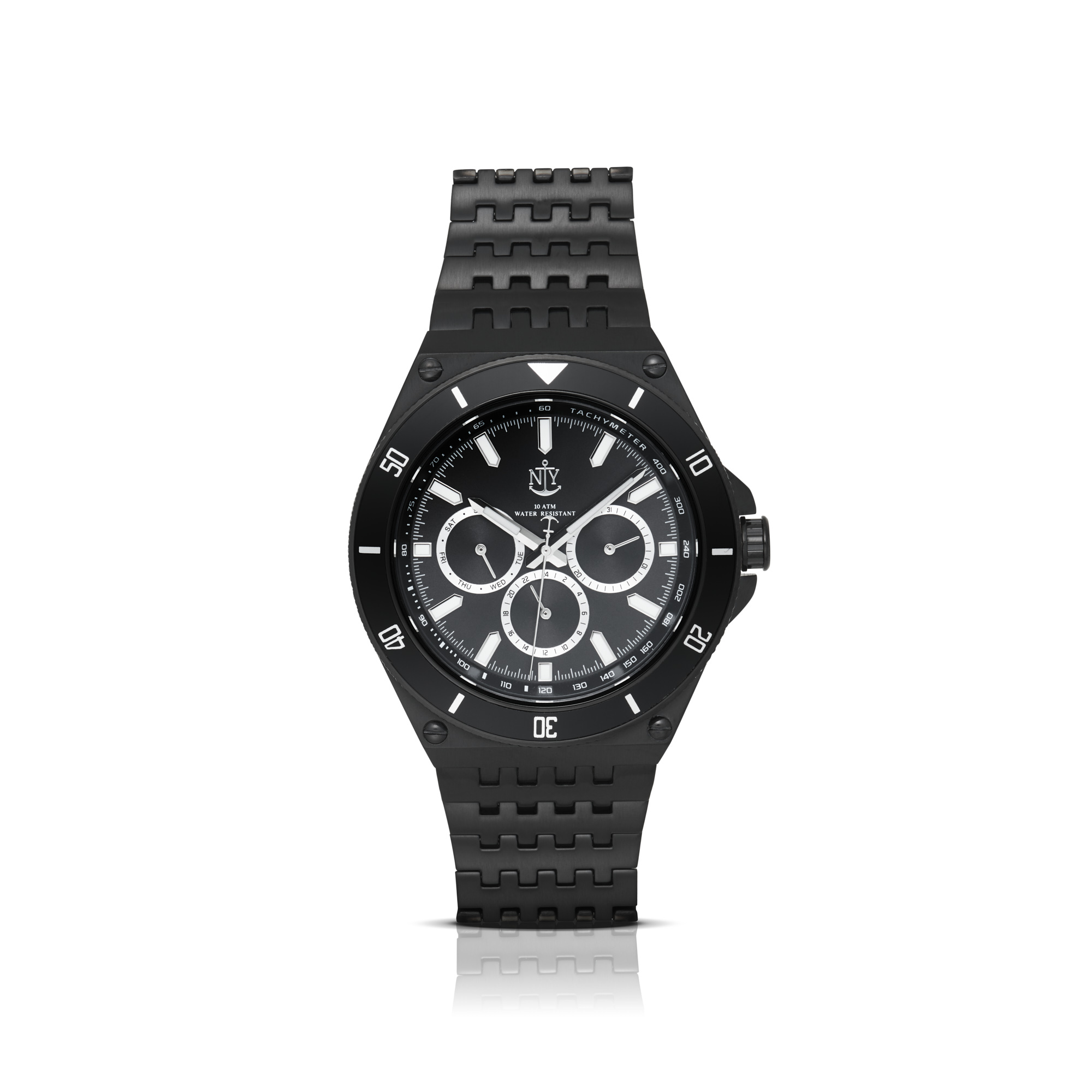
The black watch in this image is contrasting against the high-key, pure white background. Despite the dark subject it’s a relatively bright image. This is the style of image that is very often used as a packshot image that highlights the subject in a positive manner. The shadow and reflection under the watch have been added in post production but serve to ‘ground’ the product rather than have it floating in the middle of the image. Although there are light areas and reflections on the watch they do not look prominent.


When shooting products that are to be used with different coloured backgrounds there are a number of factors to consider to ensure that the product still looks at its best when composited on to the background. Not considering these aspects may well result in an image that looks obviously composited.
The main thing to look for are bright outlines around the product. These are usually caused by shooting the subject on a bright white background without using black cards or ‘flags’ to block out the background light. This light then falls on, or is reflected on to the product. Also, reflections on glossy surfaces would not be present if the image was shot on a black background and look out of place when the subject is cut out and placed on a dark background. Obviously transparent objects look very fake when placed on a different coloured background – there’s a lot of images on Amazon that suffer from this. Have a think about this next time you’re shopping there!
Simply, if you know that you are going to use difference backgrounds then it’s often best to shoot on a grey background. Keep an eye out for stray reflections and you can provide clients with 2 very different looking images with minimal extra work.
This article can be viewed in the November/December 2020 Cameracraft magazine, which is produced in association with The Guild of Photographers.
